Embracing Constraints
The 2 design frameworks Apple used to transform the dreaded notch into Dynamic Island 🏝
Apple just held their September event where they launched improvements across the iPhone, Airpods and Apple Watch product lines.
And despite launching the brand new Apple Watch Ultra which competes head to head with companies like Garmin, something else was the talk of the town.
Something small. Something that should have been insignificant.
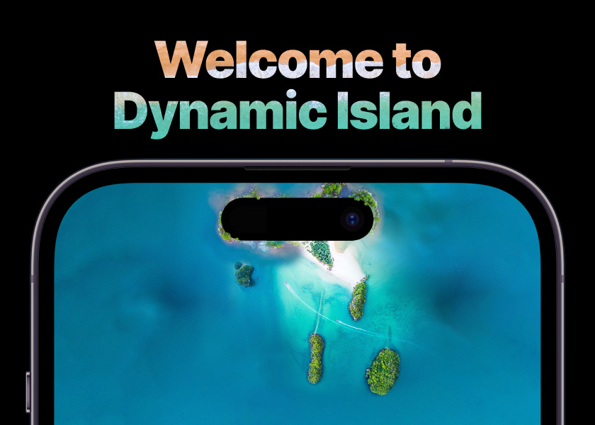
Dynamic Island 🏝
If you didn't watch the event, that probably makes zero sense to you, but hopefully by the end of this, you'll not only understand the hype but also the two underlying frameworks that are driving Apple's strategy.
The Pursuit of Full-Screen
Apple rocked the smartphone wars in 2018 with the release of the iPhone X. The full-screen experience felt futuristic. I remember buying one from the Apple Store in NYC and couldn't stop playing with it!
It was the first evolution of the smart phone after the iPhone 4 that felt... fresh. And it left us all wanting more.
I'm sure none of us thought that 4 years later we'd still have a notch buuut... *shrug*
The challenges for a true full-screened device are not small.
You have to figure out what to do with the front-facing camera, speaker, sensor array and FaceID hardware, all of which is integral to the device. They can't just go away. But they also needed to avoid the traditional forehead design of the iPhone 8 and its predecessors.
So they sort of crammed it all into a notch at the top of the phone.
Each year they've reduced the size of that notch and, to be honest, you stop noticing it after an hour of using the phone. But the fact that it isn't TRUE full-screen is still a big question mark on the table.
What's next?
There are some novel ideas being experimented with by other phone companies.
Option #1: Hole Punch Camera
This method has been very successful in some of Apple's most fierce competitors like Samsung's S series and Google's Pixel lineup.
But in order to shrink the notch down to a hole punch, they would have to build a fingerprint reader beneath the screen in order to get rid of the Face ID hardware.
While I know Apple is capable of doing this very well (and have probably built prototypes in their top secret labs), it would have the negative effect of closing the design gap between them and their competitors, making iPhone less distinct.
Option #2: Hidden Hole Punch Camera
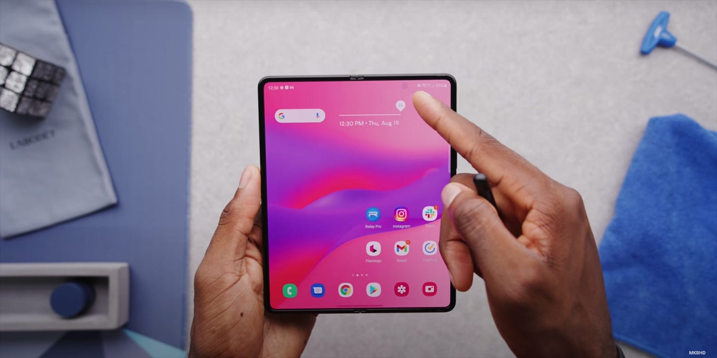
Riffing off of the first option is the still-nascent technology to hide the front-facing camera behind the display like we’ve seen in the Samsung Z Fold 3.

It’s (mostly) hidden beneath the glass and the display which has the side effect of both blurring the display in that patch of pixels and reducing the quality of the images taken with it.
This has forced the companies who have adopted this tech to build additional image-processing into their software to compensate and it simply doesn't cut it. Especially not for a company like Apple.
Option #3: Mechanical Pop-Up Camera
The pop-up camera is a novel piece of technology. We've seen this in phones like the OnePlus 7. And

The problem is that you have to build new hardware to support the camera's periscoping function and that extra moving part is much easier to break.
Design Frameworks
To tackle this question, Apple employed two classic principles of design:
Framework #1: Branding
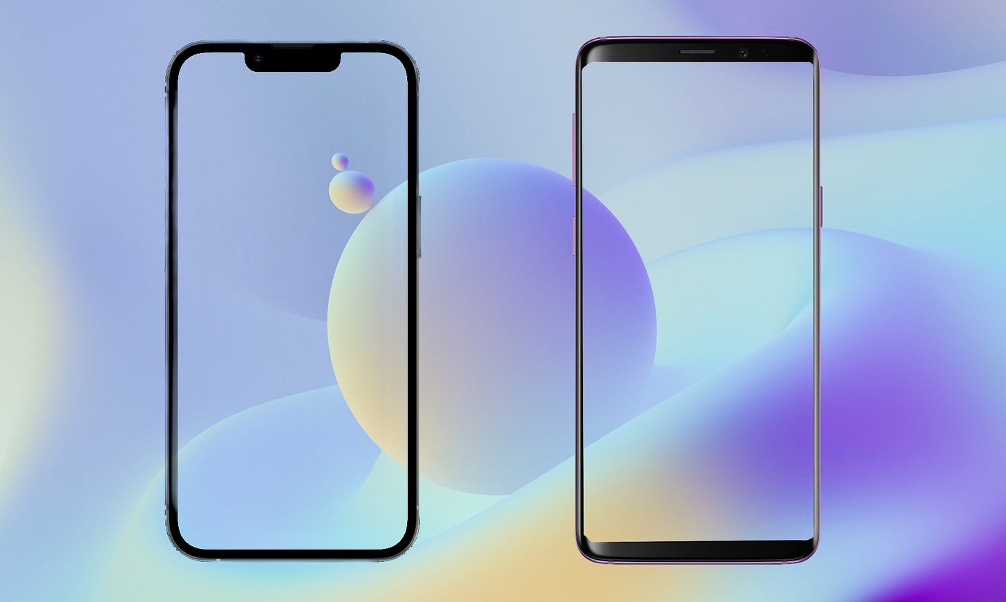
The iPhone's notch and even the new MacBook notch has become an iconic silhouette. This is a masterclass in highlighting your weakness in order to build recognition and familiarity.
If you look at the two frames above, you probably wouldn’t be able to tell me what the phone on the right is. But I bet you could tell me that the phone on the left is an iPhone.
While using a design similar to a competitors’ would offer a better user experience in the short term, Apple has chosen to take the longer route of continuing to reduce the size of the notch little by little and embrace the look as an iconic element in their hardware lineup. A distinct design leads to brand awareness and recognition.
Framework #2: Constraints
Designers are often asked to create something within a set of constraints whether that's the size of the canvas, the color palette, the budget or any number of other variables. And the most experienced designers will tell you that their best work is often birthed out of these constraints.
The designers at Apple know this well.
^^List of other Apple products that thrived in constraints^^
So they decided to design FOR the hardware, rather than around it.
The Grand-Slam Innovation
The innovation came in two parts: The Pill and Dynamic Island.
The Pill wouldn't have worked without Dynamic Island and Dynamic Island wouldn't have worked without The Pill. It was an incredible double play that ultimately won the eyes and hearts of Apple fans across the world.
Play #1: The Pill
In step with their last three generations of iPhones, Apple once again reduced the size of the notch by about 30%. But they actually broke the mold this time. Rather than a notch, it's now a pill.
I'm sure Apple's branding and design departments had a bit of a tussle over this decision as it does remove one of Apple's most unique hardware elements from a branding perspective.
But in the end, I believe that the design department was able to sway them over to their side because of the second part of their master plan: make The Pill the star of the show.
Play #2: Dynamic Island
In a stroke of genius, they not only embraced the notch as an iconic design element, they went a step further and designed a beautiful experience around it.
By putting it front and center, they have shifted the user's perspective. It's no longer an eye sore but a critical part of the iOS user experience. The notch is now hidden in plain sight.
The Win
Now one big question still lingering in my mind is whether or not Apple will continue to push toward a full-screen experience.
The Pill + Dynamic Island bought them a lot of time. They can continue to keep the necessary hardware in the pill, unobstructed and safe, while diffusing the notch haters.
Ultimately, I believe they'll continue pushing toward the Nirvana of a true full-screened device. But now, they have the time to do it right.
P.S. I almost titled this article, "Turning Pills into Islands 🏝" which sounds like the title of a drug lord's biography.


